Alka Mahapatra
About Me
Projects
Resume
Year
Jan'25 – Apr'25
Tools
Deliverables
Journey Map, Psych Mapping, Ethical UX Redesign, A/B Testing, Final Prototype
Role
UX Researcher & Designer
Frontier Airlines -
Ticketing UX Redesign
In collaboration with Sarosh Manzar, I redesigned Frontier Airlines' ticket booking flow to reduce manipulative patterns and build user trust. The existing system caused decision fatigue, hidden fees, and intrusive upsell pop-ups. We applied humane design principles to prioritize clarity, reduce friction, and empower informed decision-making.
Our redesigned experience doubled task speed, improved user trust by 65%, and was preferred by 5 of 6 users in A/B tests.

The redesigned booking flow improved clarity, trust, and usability without sacrificing essential business goals. By restructuring pricing visibility and reducing manipulative interruptions:
-
Task completion time improved by 2x
-
Reported user trust increased by 65%
-
5 out of 6 users preferred the redesigned version
TL;DR
The result is a transparent, user-respecting interface that simplifies decisions and builds long-term loyalty.

The Problem
The existing Frontier website uses a sequence of manipulative design choices that mislead users at key moments.
-
Displaying only price differences instead of full totals.
-
A disappearing comparison chart that prevents informed evaluation


-
Frequent upsell pop-ups that interrupt flow and pressure decision-making
-
Automatically pre-selected options such as SMS opt-ins


The experience becomes increasingly frustrating after a user selects their flights. The interface complicates simple tasks, erodes trust, and increases drop-off risk. These issues were addressed by centering the redesign around transparency, simplicity, and ethical interaction design.
Analysis
⬇️ To prioritize improvements, we conducted an analysis of the current flow.
Using journey mapping and peak-end analysis, the high and low moments of the current experience were identified:
-
Peak: Initial search via Google Flights shows promising low fares
-
Pit: Pricing confusion, unclear options, and relentless upsells
increase friction
-
End: The final screen includes a pre-selected SMS opt-in that undermines trust

The user journey revealed a downward emotional trajectory beginning immediately after flight selection. This insight shaped the design priorities, focusing on persistent pricing visibility, reduced interruptions, and removal of hidden choices.
Psych Journey
To quantify emotional pain points, we mapped the psych journey step-by-step.
Each step of the original flow was scored based on its psychological impact. Emotional highs were short-lived and quickly replaced by cognitive overload, dark patterns, and decision fatigue.
-
The journey starts at +20 after seeing low fares, but falls to -50 due to confusing baggage flows and deceptive upsell pop-ups
-
Key drop-off moments occurred during bundle selection, baggage selection, and the upsell stage
-
Trust-breaking elements outweighed positive ones, especially in the middle and end of the flow
This scoring framework provided a structured approach for identifying which interface elements most harmed the experience.
Persona
To guide our solution, we developed a user persona grounded in behavioral insights.

“Is it too much to ask for a simple and honest booking experience?”
David McGlone
Age: 38
Occupation: Operations Manager
Location: Chicago, MI
David is an organized Operations Manager based in Chicago. He values efficiency and a straightforward approach in most aspects of his life, including travel. He travels a few times a year, often for a mix of leisure (visiting family and friends in different states) and occasional short business trips. Being mindful of his budget is important, so he often looks for good deals on flights. While he appreciates a good price, he dislikes feeling nickel-and-dimed or tricked by hidden fees and manipulative tactics during the booking process. He prefers clear information and a smooth, predictable experience that doesn't waste his time.
Goals
-
Clear Total Cost: Easily see the complete price of flights and bundles upfront.
-
Efficient Booking: Quickly navigate the process without unnecessary steps or distractions.
-
Informed Choices: Understand the benefits of different options without losing key comparison points.
Frustrations
-
Hidden Charges: Unexpected fees added late in the booking process.
-
Pushy Upsells: Constant and irrelevant prompts to purchase upgrades.
-
Confusing Pricing: Difficulty understanding the actual cost of bundles and options.
With this understanding, we moved into designing a solution that directly addressed the user’s key frustrations.
Solution
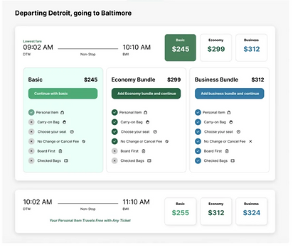
Key Feature 1 : Transparent pricing with Baggage Information Integration
This key feature directly addresses the user frustration of unclear and manipulative pricing encountered in the Original design, where users are misled by "+[Difference]" pricing.

The design prioritizes transparency by presenting the total price for each fare option (Basic, Economy, Business) upfront and prominently. This eliminates the need for users to perform mental calculations by adding base fares and additional charges, fostering a sense of clarity and honesty.
The baggage allowance information is integrated directly within the main search results. This addresses the pain point where users had to navigate sub-menus to understand baggage policies, leading to frustration and potential hidden costs. By surfacing this information early, we aim to provide a complete and honest overview of the true cost and inclusions of each fare.
Key Feature 2 : Simplified side-by-side comparison
This key feature directly addresses the user frustration of struggling to compare bundle prices and benefits side-by-side, as highlighted in the original design where information was scattered and required significant scrolling and scanning along with mental effort.
The redesigned interface employs a clear and simplified comparison by presenting the features and total price for each bundle (Basic, Economy Bundle, Business Bundle) in a direct, adjacent layout. This allows users to quickly and easily discern the differences in inclusions and costs without losing context.
The clear comparison empowers users with the information they need to make informed choices. Seeing the benefits and costs laid out directly instills a sense of confidence in their understanding and control over their selection, reducing feelings of being overwhelmed or misled.

Key Feature 3 : No pop-up, summary pop-up instead
This key feature directly tackles the intrusive and disruptive nature of the frequent upsell pop-ups present in the original design. Instead of these immediate interruptions, the redesigned experience introduces a respectful approach by offering a subtle upgrade opportunity within a contextual Flight Summary pop-up.
This summary appears at a natural point in the user flow, allowing them to review their chosen flight details before proceeding to payment, rather than being bombarded with unsolicited offers at every step.
By presenting the upgrade option within the Flight Summary, the design leverages strategic timing and contextual relevance. Users are more likely to consider an upgrade when they are already reviewing their booking details, making the suggestion feel less like a sales tactic and more like a helpful enhancement to their chosen flight.

Testing & Iteration
A/B Testing
Goals
Test credibility of new design - Our goal is to assess whether the new design improves perceived trustworthiness compared to the existing live site. Understand user perception toward Frontier - Also, we want to understand how the users perceive the brand's reliability through their interaction with the current website versus the new design. Enhance User Experience - We want to identify the areas of improvements in user experience by gauging the user satisfaction with the new design.
Methods
Our usability testing involved six participants from North America (ages 29–70) using a desktop to book a flight on Frontier Airlines. The key tasks included selecting the cheapest bundle with a carry-on bag to assess how users interacted with pricing and bundle benefits, and choosing between the original and redesigned upsell pop-ups to evaluate clarity and engagement.
Task 1
Book the cheapest available flight on this page, which includes a carry on bag.

Task 2
Two screenshots of upsell pop-ups were shown, side by side. One was the original and the other was a redesigned pop-up. The, the user were asked their preference in terms of their first impressions and the trust factor of those pop-ups.

vs

Learnings
-
Overall, users found the booking process straightforward, appreciating the clutter-free layout.
-
Some struggled with lack of filtering options for baggage-inclusive fares and a visually unengaging design.
-
They found the live site to be visually better but it suffered from intrusive ads and upsells.
-
For the upsell decision, users preferred the redesigned upsell pop-up because it provided clearer details about premium benefits. However, a few users liked the left-side option because of the appealing seat images.
-
Unexpectedly, trust was not a concern for all, as they assumed that Frontier airline was reputable.
-
The testing confirmed that while the booking process is functional, introducing baggage filters, showing the bundle dropdowns upfront and enhancing the upsell design could significantly enhance user experience.
Changes made
1.We have added information about baggage in the main search results as users could not easily figure out information about baggage allowance without going into sub-menus.

2. We have increased fidelity of designs and enhanced the visual aesthetics ( eg. color-coded different ticket options) as users could not build trust in the website as they found it to be too “minimal.” Having increased fidelity will build trust due to an increase in perceived “professionalism”. Also, we have added indications like shadow and hover colors that pricing boxes are clickable as some participants could not intuitively tell that they can click through the pricing boxes to reveal a second layer of options.

3. We added a summary of the flight pop-up before proceeding to the next step as a feedback as users were not able to confirm their choices before proceeding, in case they selected a flight by mistake. Also, we have added a CTA to the flight summary, giving the users a subtle opportunity to upgrade their tier.

Final Design
The redesigned interface prioritized simplicity, transparency, and user autonomy.
Key changes included:
-
All-in total pricing clear from the start
-
Bundle comparison remained visible throughout selection
-
Upsells were integrated subtly within summary screens rather than as pop-ups
-
Bundle cards used color-coding and hover states to improve clarity and scannability
The overall booking flow was reduced in complexity while preserving essential steps. The structure supported informed decision-making, without relying on forced choices or artificial urgency.
Before After
To highlight the shift in experience, we compared the old and new designs side by side.
The redesign removed friction from decision points while supporting user needs and aligning with business intent over the long term.

Category | Original Design | Redesign |
|---|---|---|
Emotional Impact | Confusion, fatigue, mistrust | Clarity, control, and confidence |
Upsells | Multiple disruptive pop-ups | Integrated suggestions within summary screens |
Comparison | Comparison table disappears on scroll | Persistent comparison sidebar stays in view |
Pricing | Displayed partial info, forced mental math | Full totals shown upfront |
Conclusion
The redesign showed that ethical, user-centered design improves both trust and usability.
Key takeaways:
-
Removing dark patterns increased user trust by 65%
-
Subtle upsells performed better than disruptive pop-ups
-
Transparent pricing and simplified flow led to faster task completion
-
User feedback confirmed a preference for clarity and control