
Year
Oct 2022 - May 2024
Tools


Deliverables
Funnel Optimization,
Landing Pages,
Email Campaigns, A/B Testing,
Upsell & Cross-sell Flows,
Mobile App Engagement
Role
Lead UX Designer
The Ayurveda Experience
The Ayurveda Experience is a US-based wellness ecommerce brand built around educational, long-form marketing funnels. With a customer base primarily composed of older women, success depended on creating experiences that were trustworthy, easy to navigate and persuasive without feeling overwhelming.
I partnered with marketing and business teams to optimize the customer journey across email campaigns, landing pages, product pages, upsell flows and mobile engagement. Through continuous experimentation and data-driven design decisions, we improved conversion pathways while supporting customer retention and
repeat purchases.

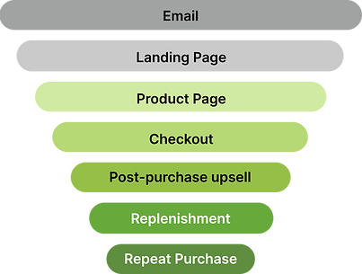
The Challenge
The Ayurveda Experience relied heavily on educational marketing funnels to convert skeptical, research-oriented customers into buyers.
Because purchasing decisions were driven by trust rather than impulse, even small improvements to messaging, content hierarchy, CTAs, and checkout experiences could significantly influence conversion rates, average order value, and repeat purchases.
My role was to continuously optimize the customer journey across acquisition, conversion, and retention touchpoints through research, experimentation, and iterative design.
02. Research
Analyze heatmaps, click data, customer feedback and behavioral trends to uncover opportunities.
01. Observe
Monitor user behavior, engagement patterns and conversion performance across funnel touchpoints.
03. Hypothesize
Identify potential improvements
and formulate testable assumptions based on observed behavior.
04. Design
07. Iterate
The Optimization Playbook
Rather than treating each campaign as a standalone design project, we adopted a continuous optimization approach.
User behavior, conversion data, heatmaps and campaign performance informed every iteration.
Create optimized experiences,
content structures and interface variations to address identified challenges.
Refine, optimize and repeat based on learnings to drive continuous improvement.
06. Measure
Evaluate performance using conversion rates, click-through rates, average order value and engagement metrics.
05. Test
Validate ideas through A/B testing and controlled experiments across emails, landing pages and purchase flows.
Awareness: Email Marketing
Email was one of the major acquisition channels. Each campaign introduced users to a product, promotion or customer story while driving traffic to dedicated landing pages. Because the audience tended to research extensively before purchasing, emails focused on education, credibility and curiosity rather than urgency alone.
Testimonial based email
.webp)

Product promotion
.webp)
What We Tested: Subject lines, Product Imagery, Font size, Hierarchy, Layout, CTA size and copy, Content density, Promotional Offers
Success Metrics: Open rates, click-through rates and Landing page visits
Consideration: Long-Form Landing Pages
User research consistently showed that users preferred educational content over short-form sales experiences.
Long-form landing pages allowed customers to understand ingredients, evaluate claims, compare benefits, and build confidence before purchasing.
Design Principle: Optimize for informed decision-making, not speed.
The experience was therefore structured to educate users, build trust through evidence and social proof, address objections proactively and gradually guide them toward conversion.


Anatomy of the page
Header
- compelling headline
- clear subheading
- hero image
- call to action button
Product Introduction
- benefits of the product
- more images
- call to action button
Top Ingredient Description
- high quality images
- the scientific name
- the benefits
Complete Ingredient List
Steps to use
- images of the process
- description
- quantity and number of times to be used
Buy Box ( Conversion)
- hero image
- image carousel
- name of the product
- ratings/ reviews
- what it does
- description, benefits
- payment methods
- call to action
Trust Signals
- customer testimonials
- badges, certifications
Frequently Asked
Questions ( FAQs)
Cross Sell
Optimization Area
Content Hierarchy
Prioritized information based on user intent, ensuring key benefits, product differentiators and offers appeared before deeper
educational content.
CTA Placement
Tested placement, frequency and visual prominence of calls-to-action to reduce friction and improve conversion opportunities.
Buy Box Design
Optimized pricing presentation, offer visibility, bundle selection and purchase controls to support decision-making.
Visual Storytelling
Used product imagery, ingredient callouts and lifestyle photography to reinforce benefits and maintain engagement.
Readability
Refined typography, font size, spacing, content density and sectioning to make lengthy pages easier to scan and consume on
various devices.
Trust & Credibility
Leveraged testimonials, expert endorsements, certifications and customer reviews to build confidence throughout the journey.
Conversion: Buy Box to Product Page to Checkout
Buy Box ( Landing Page) → Product Page → Cart → Checkout
Once customers were convinced, the focus shifted from persuasion to completion.The goal was to reduce purchase friction, improve clarity and increase average order value without interrupting the buying journey.


Retention: Driving Repeat Purchases
Acquiring customers was only the first step. Long-term growth depended on encouraging repeat purchases and strengthening
customer relationships.
Areas optimized
Post-Purchase Upsells
Recommended complementary products immediately after purchase while purchase intent was highest.
Replenishment Campaigns
Timed email campaigns based on expected product usage cycles to encourage reordering before products ran out.
Beyond the Funnel - Tracking Page
Customers frequently visited the order tracking page after purchase, making it one of the highest-intent touchpoints in the customer journey. However, the existing experience focused solely on shipment visibility and offered little value beyond tracking information.
The challenge was to support the user's primary goal while thoughtfully introducing opportunities for continued engagement.
I restructured the page architecture prioritizing user needs:
-
Order visibility: Make shipment status immediately accessible.
-
Product discovery: Surface bestselling and relevant products.
-
Trust building: Reinforce confidence through customer testimonials.
-
Support access: Reduce friction by providing customer care information.
-
Retention channels: Encourage mobile app adoption for future engagement.
As a UX Designer, my goal was to support the user's immediate need first, then introduce secondary opportunities that provide value without disrupting the core task. So that the tracking page could evolve from a purely functional utility into a post-purchase touchpoint that supported product discovery, customer support, trust-building and retention.
%201.png)
Added Value - Mobile App Engagement
Increase app adoption and encourage repeat engagement through exclusive promotions and targeted communication.
.webp)
.webp)
Key Takeaways
-
Optimized end-to-end ecommerce funnels across acquisition, conversion and retention.
-
Used experimentation and behavioral data to drive design decisions.
-
Balanced education, trust-building and persuasion for a research-heavy audience.
-
Designed experiences that supported both business outcomes and customer confidence.
Things I did on the side - Redesigning the app & A/B Testing it
Side Navigation Bar
_edited.jpg)
Bottom Navigation Bar
_edited.jpg)
Splash Screen
Collection Page
Splash Screen
_edited.jpg)
Banners
